15 ways to do a book
- - - - - - - - - - - - - - - - - - - - - - - - - - - - - - - - - - - - - - - - - - - - - - - - - - - - - - - - - - - - - - - - - - - - - - - - - - - - - - - - - - - - - - - - - - - - - - - - - - - - - - - - - - - - - - -
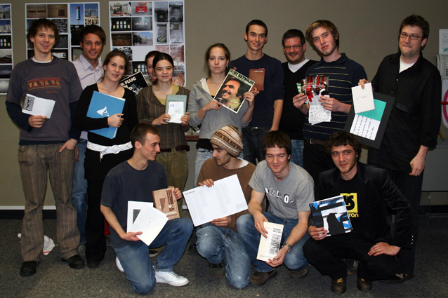
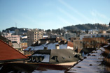
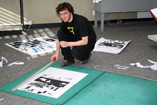
day 5, 02.02.2007
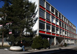
etc publications host a workshop about making books with 15 students
at the art school in La Chaux-de-Fonds, Switzerland.
-----------------------------------------------------------------------------------------------------------------------------------------------------------------------------------------------------------------------------
| day 1 | day 2 | day 3 | day 4 | day 5 |
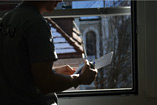
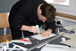
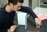
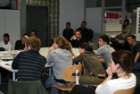
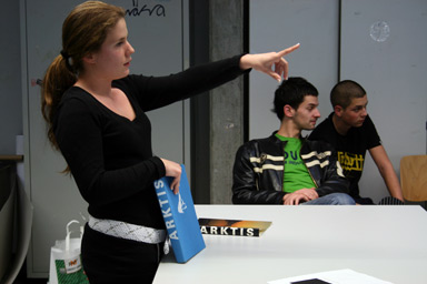
Day 5. Final Round. Ideas are taking shape. Ideas get killed. News ideas come in to play at the very last minute. Some of the group are getting nervous others are getting more courageous. By noon anybody is preparing the presentations for the afternoon. It is impressive to see that other than we originally thought we actually do have some almost finished books on our table. And after some two and a half hour of presentations, questions and documentations it is now time for apero.
- - - - - - - - - - - - - - - - - - - - - - - - - - - - - - - - - - - - - - - - - - - - - - - - - - - - - - - - - - - - - - - - - - - - - - - - - - - - - - - - - - - - - - - - - - - - - - - - - - - - - - - - - - - - - - -
"I learned one thing:
you can't make a book in one day and a half "
-----------------------------------------------------------------------------------------------------------------------------------------------------------------------------------------------------------------------------
Arnaud
Result:
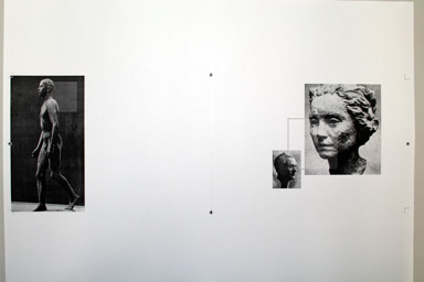
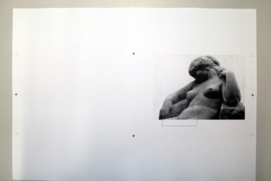
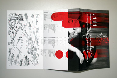
I have produced a couple of sample pages, an idea about a page structure and some layouts. I changed the format and the presentation of the images on the pages to make the content more appealing to the reader. I chose a landscape format because it is closer to our perception as human beings. The format I chose it is also more economical in production as one would use the full format of the paper. To guide the reader I planned to put some varnish on parts of the images. A matt paper would help to make the effect of the varnish even stronger. I decided to use a more contemporary type.
Biggest Challenge: to tell a story with very similar and maybe sometimes boring images. Only after a while I was confident enough to leave images out or place them in a more radical way.
Feedback etc: it is a very valuable learning to concentrate on the key issues of a concept and to be confident enough to make even drastic decisions, like leaving images out if they don't support your concept – even if you like them a lot.
- - - - - - - - - - - - - - - - - - - - - - - - - - - - - - - - - - - - - - - - - - - - - - - - - - - - - - - - - - - - - - - - - - - - - - - - - - - - - - - - - - - - - - - - - - - - - - - - - - - - - - - - - - - - - - -
Caroline
Result: I analysed the design of the book focusing on legends, design and page layout. I found a lot of different grids and some points I felt were very problematic. I developed alternative structures / design for two pages I felt very were especially problematic.
Biggest Challenge:
To reduce the number of different grids used in a big book like that. I think I understand better now how difficult it is to deal with so much content and so many different types of content.
Feedback etc: Your book really had a hell lot of different content types and it takes more time than we had in the workshop to really work out what the right structure and then the right form of presentation is. We feel your book did quite well with the variety in its layouts. But maybe you are right that it could have been even stronger if the layout and page structure where not as wide spread throughout the book, but more focused e.g. on chapters.
- - - - - - - - - - - - - - - - - - - - - - - - - - - - - - - - - - - - - - - - - - - - - - - - - - - - - - - - - - - - - - - - - - - - - - - - - - - - - - - - - - - - - - - - - - - - - - - - - - - - - - - - - - - - - - -
Christian

- - - - - - - - - - - - - - - - - - - - - - - - - - - - - - - - - - - - - - - - - - - - - - - - - - - - - - - - - - - - - - - - - - - - - - - - - - - - - - - - - - - - - - - - - - - - - - - - - - - - - - - - - - - - - - -
Dimitri
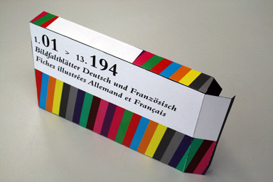
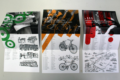
Result: I decided to split up the book and produced a box with three sample flyers. Each flyer is dedicated to one topic or one situation featured in the book. On each flyer there is the illustration and the German / French text from the original book. Plus one photograph and a graphic element, which includes a colour-code. I hope the rather dry book is now more appealing and more useable now.
Biggest Challenge:
to change the format completely and by that making it more contemporary and useful, so that you can take only the flyers you need with you and that you can even collect them if new ones were issued.
Feedback etc: The idea of making a helpful but rather dry book more popular is good. And with the overall appearance the posters and the whole box are sure more popular and contemporary. I somehow liked the variety in the visual language on the supplements to the original book, but then you are right to give it a common style to also enforce the brand of the product if flyers are used away from the box or even as posters.
- - - - - - - - - - - - - - - - - - - - - - - - - - - - - - - - - - - - - - - - - - - - - - - - - - - - - - - - - - - - - - - - - - - - - - - - - - - - - - - - - - - - - - - - - - - - - - - - - - - - - - - - - - - - - - -
Eleonore

- - - - - - - - - - - - - - - - - - - - - - - - - - - - - - - - - - - - - - - - - - - - - - - - - - - - - - - - - - - - - - - - - - - - - - - - - - - - - - - - - - - - - - - - - - - - - - - - - - - - - - - - - - - - - - -
Géraldine
- - - - - - - - - - - - - - - - - - - - - - - - - - - - - - - - - - - - - - - - - - - - - - - - - - - - - - - - - - - - - - - - - - - - - - - - - - - - - - - - - - - - - - - - - - - - - - - - - - - - - - - - - - - - - - -
Géraldine
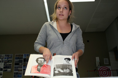
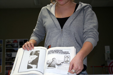
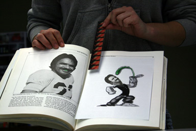
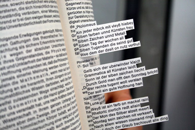
Result: The book I had about Burt Reynolds was really serious. But since I saw the spinach in his teeth on the cover the first day I could not take the book and him serious anymore. So it was my challenge to find all the mistake or strange components of the book, to bring them to the attention of the reader and to destroy Burt's career. I did not work with the serious forms of graphic design but rather in the guerilla style. I marked his red/white pattern shirt – which he wears on so many pages, I made his teeth spinach-green in many more images. I put in some interactive bits and a bookmark with the image of spinach in his teeth and a recipe and a game in the end like in a magazine.
Biggest Challenge:
To ruin Burt Reynolds.
Feedback etc: You are right in terms of more conventional graphic design the book would be difficult, but as an example of guerilla tactics or a kind of urban art strategy applied to a book it is quite interesting. Maybe with more time the interventions could have been executed in a more elaborate form, but still it is an ironic yet personal statement about the topic of the book.
- - - - - - - - - - - - - - - - - - - - - - - - - - - - - - - - - - - - - - - - - - - - - - - - - - - - - - - - - - - - - - - - - - - - - - - - - - - - - - - - - - - - - - - - - - - - - - - - - - - - - - - - - - - - - - -
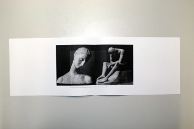
Julien
Result: For the book as a whole my idea would be to take it apart and re-organize it. So that the photography part would be in the back even turned upside down so that you would need to turn the book and open it from the back – like a two in one multipack.
Biggest Challenge:
But my biggest challenge was in the detail. I focused very much on the layout and type of one single double spread. I really wanted to understand better about how this works. I created a series of different layouts in which for example I changed the way the footnotes where presented or highlighted. In the end I produced an asymmetric page structure, even a double asymmetric page structure.
Feedback etc: It is difficult to say whether or not your last version is the solution to the problem of the book as a whole, but for sure it was an good choice to take the few days we had to work in the very detail of book design. It is an effort one needs to take at some time to really understand the subtle levels of book / type design and you will sure benefit from it with projects to come.
- - - - - - - - - - - - - - - - - - - - - - - - - - - - - - - - - - - - - - - - - - - - - - - - - - - - - - - - - - - - - - - - - - - - - - - - - - - - - - - - - - - - - - - - - - - - - - - - - - - - - - - - - - - - - - -
Ludovic
Result: My reference book had a production mistake, which made it a very special object. My result is not a real book, but a research or prototype of how this mistake could be turned into a principle, which would offer more space than the book, seems to have at first sight. I cut off about a third of the book – which also made the format stronger – and folded some of the content into the book, but I also cut pages and created an interaction between several pages.
Biggest Challenge:
I learned a lot about the element of drama in a book and about how to shift the focus of attention for a user. I also learned a lot about the view on the world.
Feedback etc: It is a super strong idea to develop a concept from a mistake and in that case the book got way stronger and way more interesting both as a object and with respects to the content. It now is super inspiring for anybody thinking about how to make a book special.
- - - - - - - - - - - - - - - - - - - - - - - - - - - - - - - - - - - - - - - - - - - - - - - - - - - - - - - - - - - - - - - - - - - - - - - - - - - - - - - - - - - - - - - - - - - - - - - - - - - - - - - - - - - - - - -
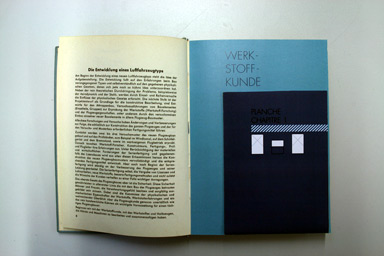
Matthias
Result: I created a hardcover book that pays tribute to my original cheap softcover magazines. It is more precious and celebrates some of the components – even some of the mistakes – of the original. It is meant to be made for those who were kids when the original magazine was out. That also determined the type size, because these people are older now and will have difficulties reading the small type by now.
Biggest Challenge:
I learned that you couldn't do a book in a day. But if you manage to focus on some strong ideas it will produce a result and some learning.
Feedback etc: The direction you took the project to be really good and sure the right way to go. You might have even taken it further towards being a precious object. Right now it looses a bit of its original charm. But it could win that again if you would manage to transform the cheap charm to a more precious charm. Maybe according to the lifestyle of those meant to by the book. It for sure is an interesting challenge to produce something very expensive.
- - - - - - - - - - - - - - - - - - - - - - - - - - - - - - - - - - - - - - - - - - - - - - - - - - - - - - - - - - - - - - - - - - - - - - - - - - - - - - - - - - - - - - - - - - - - - - - - - - - - - - - - - - - - - - -
Namir
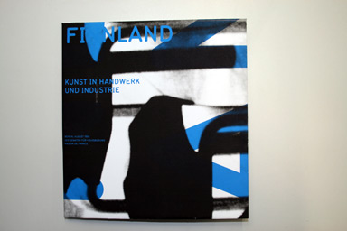
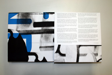
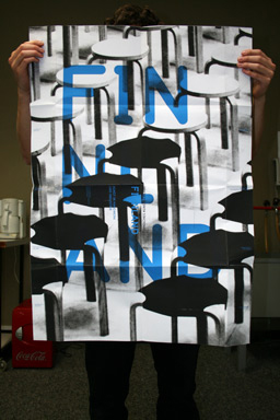
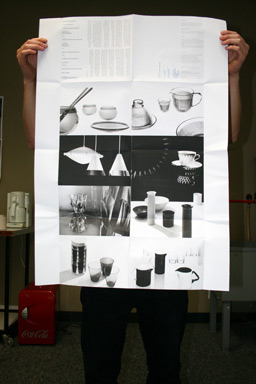
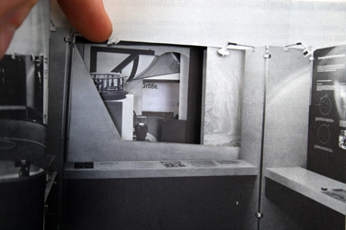
Result: My book was the documentation of an exhibition of finish arts, craft and design. To me an exhibition catalogue is mainly a coffee table book, so that my guests know that I went to see a certain exhibition. I tried to give the subject of an exhibition catalogue a new form, by transforming it into a poster as well as into an object. By that I also gave some new drama to the content. As a result I created a 1:1 dummy, but the paper was a little too thick so that folding was rather difficult.
Biggest Challenge:
To find the right relation between folding and layout was extremely difficult. I suggest not really doing this for real.
Feedback etc: I like that the format has now more of an architectural notion. It is more interactive than the catalogue before. (Maybe a little too interactive with so many folds.) It might also have been interesting to look for finish fonts for the type.
- - - - - - - - - - - - - - - - - - - - - - - - - - - - - - - - - - - - - - - - - - - - - - - - - - - - - - - - - - - - - - - - - - - - - - - - - - - - - - - - - - - - - - - - - - - - - - - - - - - - - - - - - - - - - - -
Thibaud
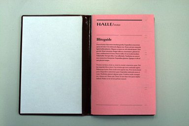
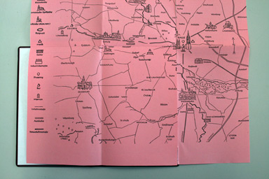
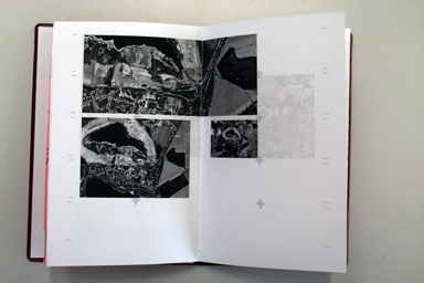
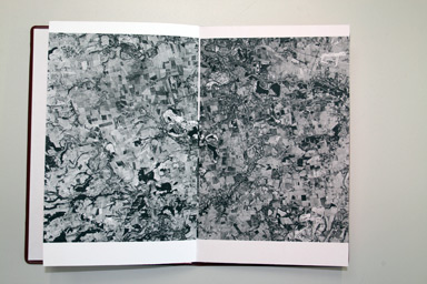
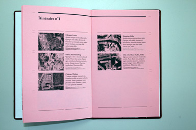
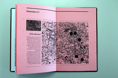
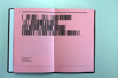
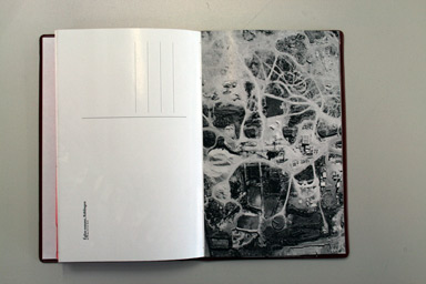
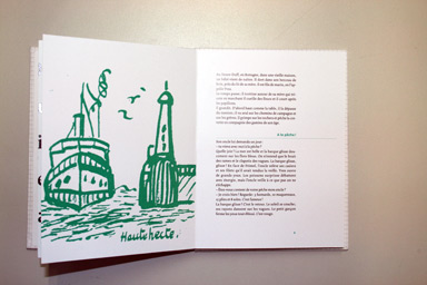
Result: I have kept the format and cover, but changed the content and design of the Halle / Saale guide book almost completely. The entry point to the book is now a map you can open up so that you can better see the content. On the map I erased some categories of which I felt that they were outdated and I added some I felt could attract a wider group of people. I tried to find contemporary images to make the visual appearance more attractive, but that was very difficult. Then I got across google earth and since it so much determines our current few and relation to the world I used their visual language. I wanted to create what I call a "blitzguide": I suggest two tours for visitors, instead of leaving them alone with a lot of information. The reader would find a kind of zoom across a series of google earth images into a certain area and then very brief information about the sights in that area. I hope this would increase the curiosity of the readers to come and see the areas for themselves. I also included some postcards for the tourist. Which also do use the google earth style. They are a supplement to the book but also can help to promote the area.
Biggest Challenge:
Finding the right way of dealing with and transferring the google earth online logic into the printed form. Maybe the images should have been in color to keep their unique quality, but I decided at the beginning to stay with black and white. Also dealing with the question of horizontal and vertical presentation of spacial information.
Feedback etc: Your book indicates very good first steps into a direction we also feel could be very interesting – guide books for uninteresting places. But the challenge of a re-interpretation of guidebooks along the visual language of google earth sure requires way more time and thinking. But has an extremely interesting potential. Maybe you feel like going on with this?
- - - - - - - - - - - - - - - - - - - - - - - - - - - - - - - - - - - - - - - - - - - - - - - - - - - - - - - - - - - - - - - - - - - - - - - - - - - - - - - - - - - - - - - - - - - - - - - - - - - - - - - - - - - - - - -
Valentine
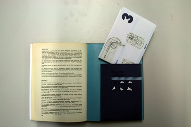
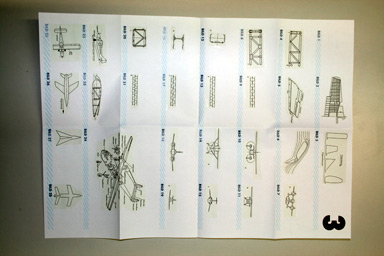
Result: I tried to transform the book into one being more usable. Therefore I extracted all the images of each chapter and put them onto a poster, which opens the chapter, but it might also be taken of and put onto an office or workshop wall as a reference. Each image has a text link into to book. The book itself I structured in a way so that one could find the chapter more easily. With thicker paper to separate the chapters. There are also drawings off how to create a paper plane on those pages. I thought this might be a bit of inspiration for the poor aircraft constructors in their daily routine. I also created an envelope to protect the book in case it would be used in a workshop or to keep the notion of a production facility to an office shelve.
Biggest Challenge:
keep the technical touch, but not loose the joy of working on it.
Feedback etc: it is not easy to create a book that is beautiful but also practical. I like that you kept the practical approach. And made it even more useful. There are some small but very nice ideas that would deserve further thinking.
- - - - - - - - - - - - - - - - - - - - - - - - - - - - - - - - - - - - - - - - - - - - - - - - - - - - - - - - - - - - - - - - - - - - - - - - - - - - - - - - - - - - - - - - - - - - - - - - - - - - - - - - - - - - - - -
Waleska
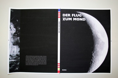
Result: I created a new format and cover, so that it is more of a book now. I wanted to give more space to the content, because before it was all so squeezed in. Now I would start from the simple but strong cover into the book with a series of empty black pages of different paper quality. As if you were going through space. Then appears the first page of the book and suddenly I change to white pages but with little text and small images. All the images that we already know, that we have seen so many times, I reduced in size. The story then builds up from smaller images to larger images, maybe even from images we know to images we have rarely seen.
Biggest Challenge:
to be radical enough to turn the existing book upside down and make the images not only smaller but really small to reach what was my original idea: much more space.
Feedback etc: It is very nice to see how you now have created a book that fulfils what the title promises: a journey into space. With the empty pages in the front you show how many different component a books as an object can have. The cover got much stronger.
- - - - - - - - - - - - - - - - - - - - - - - - - - - - - - - - - - - - - - - - - - - - - - - - - - - - - - - - - - - - - - - - - - - - - - - - - - - - - - - - - - - - - - - - - - - - - - - - - - - - - - - - - - - - - - -
Yassin
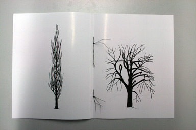
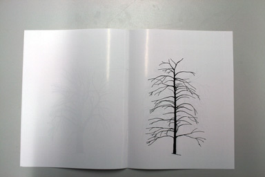

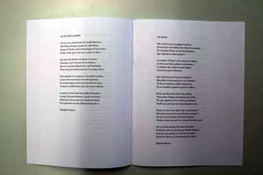
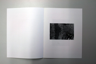
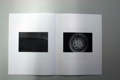
Result: I have created a new book only with the same overall topic, which was wood. I wanted a book that was poetic in the true sense of the word. So I created a book in three chapters. One on the different shapes of trees. The images were taken from the original book. Second comes a section with poems I found on trees and third a section with rather abstract and structural images of trees, also taken from the original book. Ideally the three sections should have three types of paper. The cover I would imagine to be a hardcover with linen on it.
Biggest Challenge:
to stay focused with my vision of the book.
Feedback etc: you did well. It is impressive to see how focused you were in your idea and selection of content. There were a lot of very different opportunities I the original book, but it is good that you have not taken all the opportunities. I expected more of a deep, dark, dense forest type of mood. But your book is way different, very calm, and yet very intense.
-----------------------------------------------------------------------------------------------------------------------------------------------------------------------------------------------------------------------------
< back to top